

This is so bad.
-
It’s not a map.
-
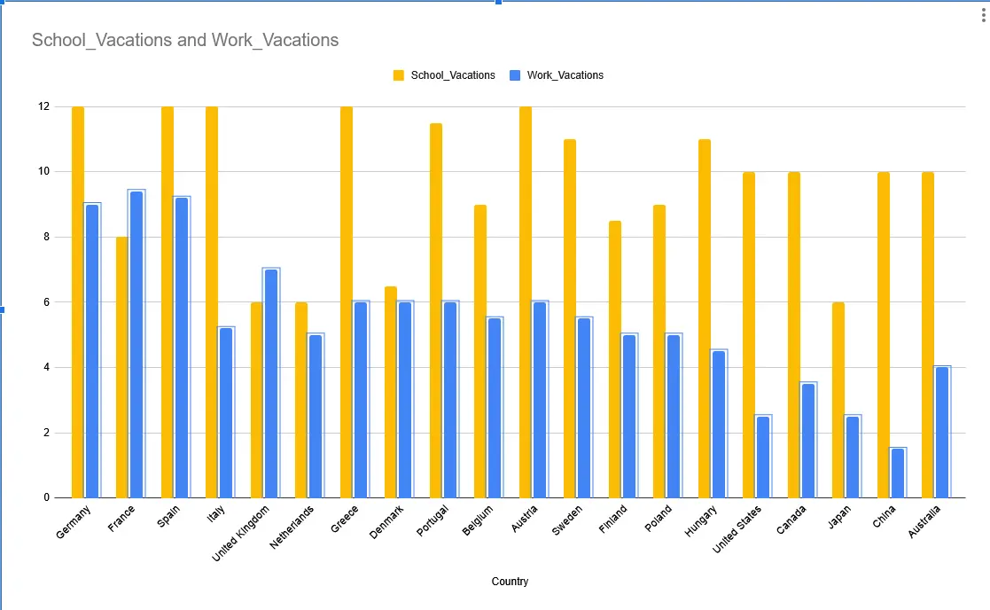
Why is there no label on the vertical axis. Are we talking days, seperate vacation periods (of different length) or percentage of days in a year?
Oh there’s weeks in the title. Still a bad graph. -
What does School_Vacations and Work_Vacations actually mean?
I was trying to have a working ai prompt to generate this via svg but they’re still so stupid . Countries should have been colored according to the numbers in percentage
So you admit the plot is poorly done and still decided to share it here for some reason?!
Yes , for the idea, you know? Jee…
-
Source?
Sorry but the UK position is definitely wrong. Our kids get 6 weeks off just in summer, plus 2 each at Xmas and Easter, plus 3 x 1 week during half-terms. It is a challenge to cover these when working full time where the average holiday allowance is 5.6 weeks in total.
Nice idea but very poor execution
which projection is that?
Hmmm, I’m gonna doubt this data. In spain, the norm is getting around 30 days of holidays when working and that’s considering that weekends count toward those 30 days even if you don’t work.
Germany is wrong, too.
I am also gonna doubt this data as the Netherlands has 6 weeks of summer vacation alone. I think we also do 12 weeks school and about 28 days a year fulltime for work.
yeh, UK school kids get 6 weeks holiday in the summer alone.
deleted by creator


